
 Varad
Varad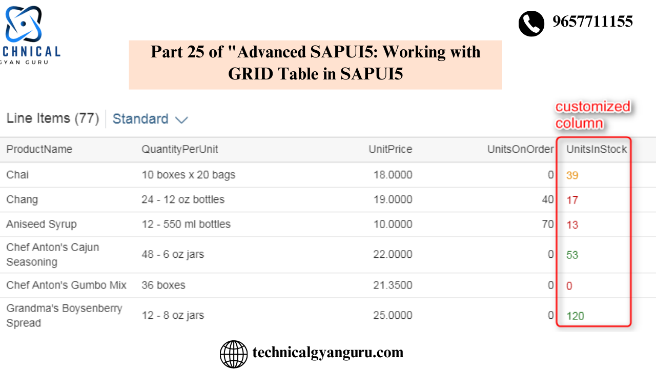
A responsive table should only show up to 100 records. However, grid tables are designed to present large amounts of data.
Mobile, tablet, and desktop/laptop rendering are all supported via responsive tables. However, grid tables only function properly on desktop or laptop computers.
While grid tables do not support grouping, responsive tables allow records to be grouped.
Grid Tables allow for horizontal scrolling and column freezing. Horizontal scrolling and column freezing are not permitted in responsive tables. It was implied that you could not have more columns in a responsive table than your screen could accommodate.
After listing the distinctions between the two kinds of tables, let’s generate a sap.ui. Table.
With the Web IDE, create a new SAPUI5 application by using the template.
After creating an empty project, it ought to appear like this.

In View, create a sap.m.ui.Table UI Control.
Make a Table Control in the view’s content aggregation section. Please be aware that the header area of the view only displays two namespaces by default when you build a project from template. Below are examples of these: sap.m and sap.ui.core.mvc.

Thus, you can only create UI controls that are included in your sap.m library by using these two. In our situation, in order to develop Grid Table UI Control, we need to add a few more namespaces. The namesap.ui.table.Table and sap.ui.table.plugins are the two recently added namespaces. View the recently added namespaces below.

Create a Table control to show three columns and ten rows in a table format after the additional namespaces are introduced. View the code below.
<mvc:View controllerName="demo.sap.uitabledemo.controller.View1" xmlns:mvc="sap.ui.core.mvc" displayBlock="true" xmlns="sap.m"
	xmlns:ui="sap.ui.table" xmlns:plugins="sap.ui.table.plugins">
	<Shell id="shell">
		<App id="app">
			<pages>
				<Page id="page" title="{i18n>title}">
					<content>
						<ui:Table id="uitableid" rows="{/Customers}" title="Customers" selectionMode="MultiToggle" visibleRowCount="10">
							<ui:columns>
								<ui:Column>
									<Label text="Customer ID"></Label>
									<ui:template>
										<Text text="{CustomerID}"></Text>
									</ui:template>
								</ui:Column>
								<ui:Column>
									<Label text="Compnay Name"></Label>
									<ui:template>
										<Text text="{CompanyName}"></Text>
									</ui:template>
								</ui:Column>
								<ui:Column>
									<Label text="Postal Code"></Label>
									<ui:template>
										<Input value="{PostalCode}"></Input>
									</ui:template>
								</ui:Column>
							</ui:columns>
							<ui:plugins>
								<plugins:MultiSelectionPlugin selectionChange="onSelectionChange"></plugins:MultiSelectionPlugin>
							</ui:plugins>
						</ui:Table>
					</content>
				</Page>
			</pages>
		</App>
	</Shell>
</mvc:View>

You may observe that Table Control has many aggregations by consulting its API documentation. I’ve used rows, columns, and plugins—three of its aggregations—in this blog article. Additionally, take note of the fact that I’ve used the table’s SelectionMode property, which causes checkboxes to appear with each row so that users can choose multiple data.
In a similar manner, Columns are tied to particular properties of the /Customers collection. Please take note that these specific properties are bound by the UI components that are presented inside the template aggregate of the column, not by columns directly.
Establishing a DataSource and an Application Model
For the application, a Data Source and Model must be created. Northwind OData service will serve as the foundation for this model. Open your manifest.json file and choose the Data source tab in the descriptor editor to accomplish this. Click on the Add icon in the Data Source tab, then choose the “Service URL” option from the wizard that appears. Complete the OData model construction process by following the wizard. Put “MyModel” in the Mode’s name.
In the controller of View, write code.
Get the instance of the model you produced in the previous step and place it on the Table Control created in your view using the onInit() method of your controller.
onInit: function () {
		var oModel = this.getOwnerComponent().getModel("myModel");

		this.getView().byId("uitableid").setModel(oModel);
		},
Once this is done, data from the /Customers collection of Northwind OData service will start showing in your table

Let’s now construct an event handler for the plugin we added to the view’s selectionChange event. This is the event handler’s code. Since it makes use of the MessageToast class, the define statement of the controller must include it. displayed as indicated in the image below.

Event handler code
onSelectionChange:function(oEvent)
		{
			debugger;
			var iSelectedRows = oEvent.getSource().getSelectedIndices().length;
			MessageToast.show(iSelectedRows + " row(s) selected" );
		}
With this code in place, your table will now respond to SelectionChange events. Try to select the checkboxes and a Message Toast will appear showing how many records of the table are selected.

The grid table has many additional attributes, aggregations, and events. These will soon have blog postings available here. Pay attention. Please leave a remark below if you have any questions, concerns, or recommendations for us. I will be pleased to reply to you.
YOU MAY BE INTERESTED IN
10 Real-World SAP ABAP Programming Examples (with Code!)
Your Definitive Guide to Becoming a SAP ABAP Developer